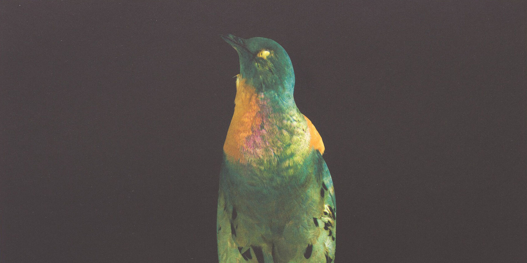
Banner image: Detail, Susan Middleton, Requiem, 2008, color photogravure, National Gallery of Art, Washington, Gift of Kathan Brown, Courtesy Susan Middleton
Anne Appleby
Anne Appleby's Verona Suite suggests the shifting light and changing colors of a poplar forest near Verona, Italy. Appleby neither works directly from nature nor collects color samples. Rather, she chooses colors based on intuition and memory. The final print’s subtle and luminous color variations, created by overprinting layers of semitransparent inks, are, for Appleby, evocative of the poplars’ seasonal growth cycles. For example, the green rectangle in the second position of the final print (see slideshow, above) is tinged with light green and orange, suggesting the transformation of deciduous leaves from spring to fall. In the working proofs, Appleby tested the impact of two shades of pink on the overall color harmonies by overlaying rectangles cut from earlier proofs.

Anne Appleby (right) watches as Crown Point printer Dena Schuckit mixes pigments for Verona Suite, photograph by Kathan Brown, Courtesy Crown Point Press
"Yes, No, Maybe: The Art of Making
Decisions," lecture by exhibition curators Judith Brodie and Adam Greenhalgh (audio)
Julie Mehretu, artist, in conversation with curator Judith Brodie, Diamonstein-Spielvogel lecture (audio)
"An Insider's Perspective," lecture by Kathan Brown, founder of Crown Point Press (audio)
Exhibition tour by curators Judith Brodie and Adam Greenhalgh (audio)


