Skip to Main Content

Use our guide to explore works by queer artists on view in our galleries.

Discover the inspiration, communities, and influence of artists from Marie Laurencin to Andy Warhol. Take this guide with you through the galleries. You will need a map. Pick one up at any information desk or use our app.

Estimated time for the tour: 45 minutes

Start in the East Building or Sculpture Garden.


East Building

Ellsworth Kelly, Color Panels for a Large Wall
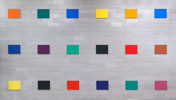
Three rows of six horizontal, rectangular canvases, each painted a single, saturated color, hang in a widely spaced grid against a three-story gray stone wall in this photograph. Moving from our left to right, the canvases in the top row are carrot orange, pine green, royal blue, canary yellow, marigold orange, and azure blue. The middle row has panels in marine blue, amethyst purple, shamrock green, soot black, vivid red, and rust brown. The bottom row canvases are banana yellow, black, coral red, midnight blue, emerald green, and orchid purple. The smaller, rectangular stones in the wall behind the panels are also laid horizontally, and they vary from silvery white to smoke gray.
Ellsworth Kelly, Color Panels for a Large Wall, 1978, oil on canvas, 2005.87.1

“I wanted to give people joy.”

American painter and sculptor Ellsworth Kelly made this spectrum of paintings in 1978—for a bank of all places. He had only recently returned to working in color after a period of using only black and white. The artist attributed his love for color in part to birdwatching. Seeing the creatures fly inspired him to consider the relationship between color and space.

Kelly considered these 18 canvases a single work. He made a new arrangement of the panels for this wall when the work entered our collection in 2005. This tour also includes a work by one of Kelly’s partners, American artist Robert Indiana—see his work below.

Ground Floor, Atrium

Learn 10 facts about Kelly’s life

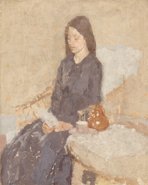
Gwen John, The Convalescent

Gwen John, The Convalescent, c. 1915-1925, oil on canvas, 1994.59.15

“I cannot imagine why my vision will have some value in the world. And yet I know it will.”

Welsh artist Gwen John is known for her paintings and drawings of quiet interiors, often featuring women. Her depictions of friends, fellow artists, and models seated alone in quiet spaces led many to assume she was solitary and introverted. But her striking self-portraits show a self-assured, confident artist.

John worked in London and Paris. She moved in artistic circles with painter James Abbott McNeill Whistler and sculptor Auguste Rodin. (John famously had a 10-year relationship with Rodin. From her letters, we know that she was also involved or infatuated with a number of women.)

During her lifetime, these better-known male artists, as well as her younger brother Augustus, also an artist, overshadowed her. Nevertheless, John was dedicated to her practice and vision.

Ground Floor, Gallery 103

Marie Laurencin, In the Park
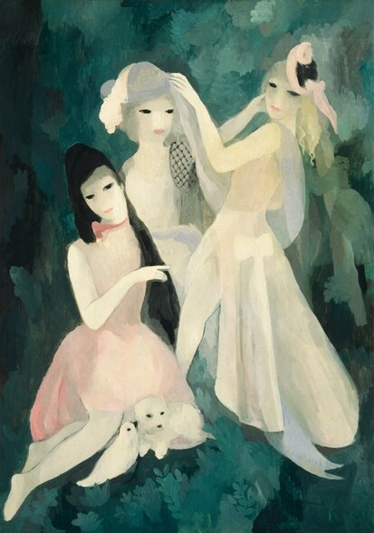
Marie Laurencin, In the Park, 1924, oil on canvas, 1963.10.158

“Why should I paint dead fish, onions, and beer glasses? Girls are so much prettier.”

French artist Marie Laurencin is known for her ethereal paintings of a world that centered women (and animals). Her pastel-hued odes to feminine beauty established her place in Paris’s avant-garde art scene in the early 20th century. Once famous, Laurencin also made fantastical ballet costumes and sets as well as decorative arts.

Laurencin was part of a circle of creative women in Paris, many of whom were also queer. She regularly attended salons held by American author Natalie Clifford Barney. Author Getrude Stein was one of her first patrons.

Ground Floor, Gallery 103

Roni Horn, Opposite of White, v. 2 (Large) (A)
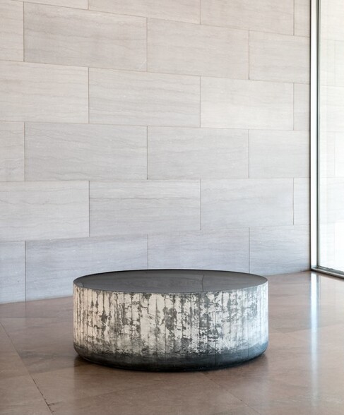
Roni Horn, Opposite of White, v. 2 (Large) (A), 2006-2007, solid cast black glass with fire-polished top, 2015.63.1

“When I was young, I decided that my sex, my gender, was nobody’s business.”

American conceptual artist Roni Horn plays with the properties of glass. She began her Opposite of White sculptures by gradually pouring liquid glass into a mold. She then allowed them to cool and solidify for months. While the sides remain rough to show the texture of the molds, Horn polishes the top to a smooth, slightly sunken curve, imitating the surface tension of liquid.

Horn’s nonbinary identity informs this work. Standing over the sculpture, you might think you’re looking at a still pool of water—or is it peering deep into a well? You question whether something that appears one way might really be another, or both at once. Just when you think you’ve grasped its nature (solid or liquid), it slips away from you.

Mezzanine, Terrace

Jess, Ex. 5 - Mind's I: Translation #12

Jess, Ex. 5 - Mind's I: Translation #12, 1965, oil on canvas on wood, 1997.79.1

“I salvage loved images that for some reason have been discarded. . . I put forward a new layer of sentiment that, combined with the old, may hopefully allow the image to have a new life or at least a half-life.”

This artist took the mononym Jess when he severed connections with his family, who disapproved of his homosexuality. Jess and his partner poet Robert Duncan were an influential artistic couple in San Francisco for nearly 40 years.

Between 1959 and 1976, Jess made a series of 32 “Translations” using found images from sources like Scientific American magazines, children’s books, and textbooks. He reproduced them with thickly textured oil paint. The artist also changed the colors into what he called an “imaginary complex of color that is my translation of that original.”

Ex. 5 – Mind’s I: Translation #12 features a diagram of a convex mirror, showing how tools can change our visual perception.

Upper Level, Gallery 415


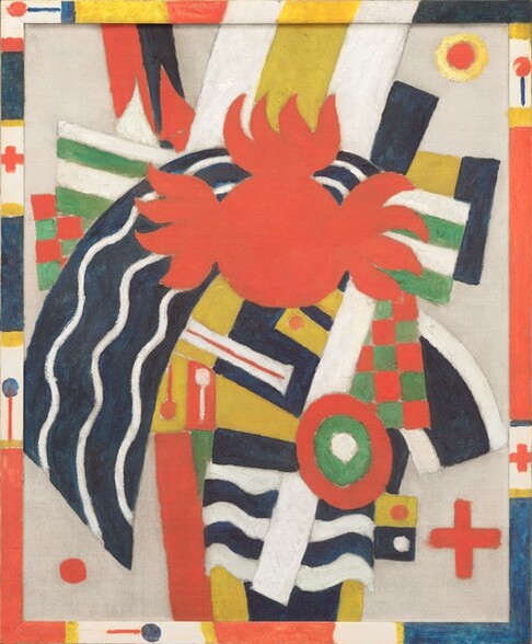
Marsden Hartley, The Aero

Layered circles and dots, crosses, checkered patterns, curved and wavy lines, and other geometric shapes in tomato red, shamrock green, buttercup yellow, royal blue, black, and bright white float against a field of unpainted canvas in this vertical, abstract painting. The shapes are most densely packed at the center of the composition. The eye is drawn to a red circle with flame-like forms at the sides and top, about three-quarters of the way up the canvas. Immediately underneath it and arcing out to our left is navy-blue band with three white, wavy lines. Other patterns to either side of the central red shape include two flag-like squares of alternating green and white stripes near two other patches containing a red and green checkered pattern. Other areas are patterned in black and yellow stripes, and blue and white stripes. Dots, lines, and lollipop-like shapes are scattered sparsely through the rest of the composition. Three shapes float near three of the corners, not touching anything in the layered, central portion: a red circle within a yellow ring at the upper right; a red dot at the lower left; and a red cross at the lower right. The frame was painted by the artist in the same colors as the canvas, with bands of color separating dots, crosses, and the lollipop-like form.
Marsden Hartley, The Aero, c. 1914, oil on canvas, 1970.31.1

“My work embodies little visions of the great intangible.”

In his early career, artist Marsden Hartley was a groundbreaking American modernist with an innovative painting style. Hartley lived in Berlin, Germany, from 1913 to 1915. There, he befriended painters such as Wassily Kandinsky.

In Germany, Hartley also caught “zeppelin fever,” an international mania for the huge new airships. He wrote to his art dealer Alfred Stieglitz in 1913, “I have one canvas ‘Extase d’Aéroplane’ if it must have a title—it is my notion of the possible ecstasy or soul state of an aéroplane if it could have one.” Hartley may be referring to The Aero, his joyful abstract interpretation of the thrill of going airborne. The layered imagery of the cross and stripes may allude to Karl von Freyburg, his friend and probable lover. A German officer, Von Freyburg was killed early in World War I. Hartley kept one of the shoulder pieces from his military uniform for the rest of his life.

Upper Level, Gallery 415

Andy Warhol, Green Marilyn
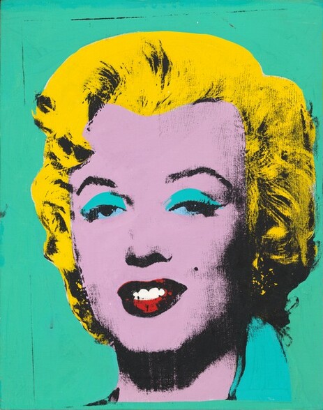
The head and shoulders of a young woman shown against a solid, turquoise-green background fills this stylized, nearly square portrait painting. She faces and looks at us. Her face and neck is a field of orchid purple. Her eyelids are covered in crescent-shaped areas of turquoise above small areas of arctic blue, overlaid over the whites of her eyes and iris. Her full lips are covered with bright scarlet red. Black shading picks out her arched eyebrows, her heavy-lidded eyes, the shadow under her nose, her smiling mouth, the hollows under her high cheekbones and at her temples, and the shadow her chin casts on her neck. She has a mole between her left nostril and the left corner of her mouth, on our right. Her short, wavy hair is swept up from her forehead and overlaid with a field of canary yellow over the black shading that indicates curls along the sides of her face and along the back of her neck. A pear-shaped area of turquoise alongside her neck to our right could be the collar of her shirt. The turquoise background is flecked with a few black vertical lines, especially near the left edge.
Andy Warhol, Green Marilyn, 1962, acrylic and silkscreen ink on linen, 1990.139.1

Beyond his Campbell’s Soup Cans, Green Marilyn may be pop art icon Andy Warhol’s most recognizable work. Warhol first began experimenting with silkscreen printing in August 1962. That same month, Marilyn Monroe died by suicide. Warhol memorialized the movie star using this tightly cropped image of a 1953 publicity still shot during the height of her fame. There are imperfections in the silkscreen technique: the marks on the turquoise background and blotches in her yellow hair. These may refer to Monroe’s fall from greatness.

The artist returned to this image of Monroe over and over again. Some of these works set Monroe’s portrait against a field of gold, like a religious icon. In one of the largest versions, he repeated the identical image 100 times across an enormous, 18-foot-long canvas.

Warhol explored themes such as celebrity, media, and death in many of his silkscreens. But some subjects were more private. For example, Warhol made prints of Archie and Amos, the dachshunds he shared with his then partner, designer Jed Johnson.

Upper Level, Gallery 407

Jasper Johns, Perilous Night
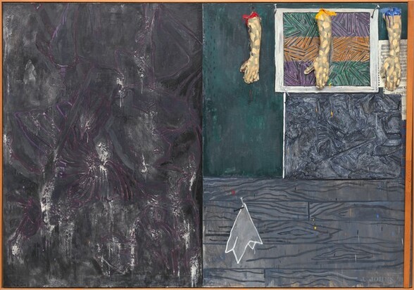
Three casts of human hands and forearms hang from the top edge of the right half of this horizontal abstract painting, which is divided vertically in two equal parts. The rectangular field to the left is mottled with steel and charcoal gray streaked with white and amethyst purple. The panel to the right is divided again so the top half is slightly larger than the bottom half. The bottom portion is painted with a pattern to resemble abstracted wood grain in nickel and slate gray. A stylized white cloth, perhaps a handkerchief, is painted to look as if hanging from a nail hammered into the wood paneling, to our left. The top portion seems to be layered with paintings and prints below and beneath the three arms. The three-dimensional arms hang from looped metal wires on metal hooks spaced along the top edge, coming about a quarter of the way down the overall composition. The peach-colored arms and hands are painted all over with irregular gray patches, creating a camouflage effect. They hang down so the open palms are flat against the canvas, the thumbs extended to our left. The top of the arm to our left is painted cherry red, the middle is painted canary yellow, and the right arm royal blue. The paint drips down the arms and splatters on the hands and on the faux wood panel below. Behind the hands, it appears that one of the artist’s prints hangs from two nails on the canvas, but this is also part of the painting. The illusionistic  print has three horizontal bands of pine green, pumpkin orange, and violet purple crisscrossed with black lines. Seeming to hang behind it and under the right-most arm is a sheet of music overlapping another piece of paper printed with the letters “OHN C” and “THE PERILOUS.” Below, and filling the space between the illusionistic print and the wood panel, is a rectangular field of abstract gray and black swirling forms. The entire canvas is surrounded by a thin, amber-colored wood frame. A narrow wooden slat is attached with a hinge on the inner surface of the frame at the bottom right corner, so the slat runs up along and rests against the canvas near the rightmost edge of the frame. The artist signed the work with stenciled letters in pale gray in the lower right corner: “J. JOHNS ‘8.”
Jasper Johns, Perilous Night, 1982, encaustic and silkscreen on canvas with objects, 1995.79.1

“It’s not about what you see, but what you see when you’re looking at it.”

American artist Jasper Johns wanted us to spend time with his works. He hoped viewers would consider the many objects, materials, and textures in his mixed media paintings.

Perilous Night is filled with details. On the right, three casts of arms hang from hooks. A maulstick, a tool painters use to steady their hands, is attached to the right edge. Under it are parts of The Perilous Night, a score by composer John Cage.

Below, a painted handkerchief hanging from a nail. This references Pablo Picasso’s series of paintings of a weeping woman. The wood grain painted behind it depicts Johns’s own front door. The mysterious square of pattern above is not entirely abstract—it is the tracing of a detail of the fallen soldier in Matthias Grünewald’s Isenheim Altarpiece from the 16th century. That same pattern, only enlarged and rotated, takes up the left side of the painting. Together, these elements may refer to the act of artmaking—tracing, copying, and replicating.

Upper Level, Gallery 403-B


Sculpture Garden

Robert Indiana, AMOR

Four deep, three-dimensional letters spell out the word AMOR in this free-standing sculpture, with the A and M stacked on top of the O and R to create a square on a low black platform. The letters are coral red with butter-yellow undersides. The elongated, oval-shaped opening within the circular letter O is angled 45 degrees, toward the M at the upper right. We stand slightly to the left in this photograph so we can see the deep sides of the letters. The sculpture is displayed out-of-doors with trees and a tall black fence in the background and plantings around the base.
Robert Indiana, AMOR, conceived 1998, fabricated 2006, polychrome aluminum, 2012.27.1

“My goal is that LOVE should cover the world.”

American artist Robert Indiana achieved his mission—his image of the stacked four-letter word is now well known. Its success can be credited to Indiana’s skill at mixing advertising graphic design with blocky geometries of abstraction. He began the design as drawings, paintings, and sculptures between 1964 and 1966. Around this time, Indiana’s decade-long relationship with artist Ellsworth Kelly was coming apart. Some versions of LOVE seem to reflect that turmoil. But the design reached a new level of fame when it appeared on an 8-cent stamp in 1973. The image became an emblem for the 1970s.

Since then, the design has been translated into multiple languages, materials, and colors. AMOR, the Spanish or Latin translation, was first made for a plaza in Madrid, Spain, in 2006.

Northeast Quadrant

May 24, 2024