
Angela Cerasuolo
“Avvertimenti de’ quali non fa bisogno ragionare”: Pigments and Mixtures in the 16th Century
“Admonishments which do not require discussion”: with these words, Giorgio Vasari (1511–1574) somewhat dismissively qualified the contents of Cennino Cennini’s Libro dell’Arte (c. 1400) in the second edition of his Lives (1568). Vasari had read and considered Cennini’s manuscript a little earlier, as demonstrated by a 1564 letter from his friend and advisor, the philologist Vincenzio Borghini (1515–1580).
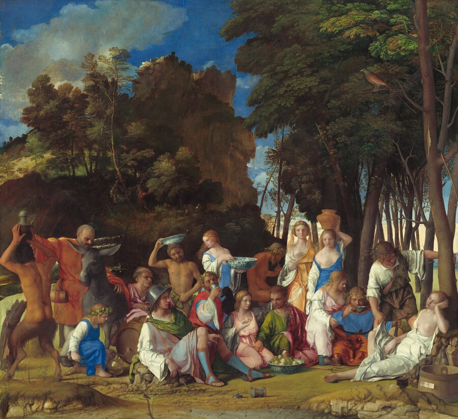
Giovanni Bellini and Titian, The Feast of the Gods, 1514/1529, oil on canvas, Widener Collection, 1942.9.1
This was neither a tendentious judgment nor a desire to downgrade a work that was in competition with his own, as has sometimes been suggested. Rather, Vasari felt no need, as the aims of his Lives was quite different from Cennini’s. Indeed, in his time, information relating to materials was easily available to painters, and we find evidence that these recipes circulated in lists of pigments found in other authors’ printed texts. For instance, we find Cennini’s lists in Il Riposo (1584) by Raffaello Borghini (c. 1537–1588) and the color lists of the so-called “Paduan” manuscript are found in Trattato dell’arte de la pittura, scoltura et architettura (1584) by Giovanni Paolo Lomazzo (1538–1592). Borghini, moreover, is also credited (or perhaps blamed, since his plagiarism was not declared) as the first to print parts of both Leonardo da Vinci’s Treatise on Painting—copying extracts from one of the abbreviated manuscripts circulating in Florence at the time—and Cennini’s Libro dell’Arte.
Our attention in this case, however, is drawn not so much to continuing traditions as it is to new additions in the 16th-century texts. These enable us to understand how the practice of art was changing in order to adapt to the new challenges that artists were embarking upon, thanks largely to the potentialities of the oil medium for imitating nature. Vasari himself, commenting on Cennini, felt the need to update the latter’s voluminous list of colors in a concise and effective manner:
he does not mention—maybe because they were not used at that time—certain pigments from quarries such as dark-red earths, cinabrese, and some glass greens. Similarly, later were discovered umber—which is an earth—giallo-santo, the smalts in fresco and in oil, and some glass greens and yellows which the painters of that age lacked.
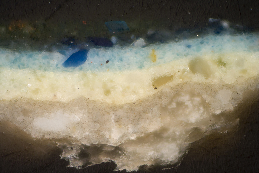
Detail and cross section of The Feast of the Gods, from the background near the nymph with a jar. The blue paint of the sky is blended from azurite, lead white, and a small proportion of an orange pigment that is a glassy lead antimonate. From Barbara H. Berrie and Louisa C. Matthew, “Venetian ‘colore’: Artists at the Intersection of Technology and History,” in Bellini, Giorgione, Titian, and the Renaissance of Venetian Painting (London, 2006)
On closer inspection, these are the very same innovations introduced in Borghini’s and Lomazzo’s treatises. The same new pigments we encountered by extending the research to other authors, those who practiced and wrote on watercolor (acquerello) technique. Among these were Cristoforo Sorte (c. 1510–c. 1595), cartographer and painter, who described the application of watercolors to maps and landscapes in his Osservazioni nella pittura (1580). Another was Gherardo Cibo (1512–1600), who painted plants and landscapes in watercolor, combining the descriptive finesse of the botanist with a modern atmospheric sensitivity to landscape. In recent years, a number of manuscripts relating to pigments and painting techniques have been traced back to him as the source, including a treatise—Trattato della miniatura—in which the recipe for “giallo de vasari” describes the preparation of lead antimonate, the pigment later known as Naples yellow.
It is worth pausing to analyze the characteristics of these pigments and to make an attempt to identify them in contemporary works of art. Two novelties are striking: the increase in the varieties of blacks and dark earths—the depth of the shadows was functional to the effectiveness of the relief and to achieve light and atmospheric effects—and the widespread use and increase in the number of transparent colors. Some were already known, such as red lakes and verdigris; others were available yet not present in Cennini’s palette, such as umber and bitumen. But the sources tell us of various transparent glass-based pigments: not only smalt, the use of which we now know was already widespread in the 16th century, but also other glass-based blues; yellows, more or less orangey in tonality, akin to the Naples yellow, the introduction of which moves further back in time on the basis of recent identifications in coeval works; and even “glass” greens—verdi di vetro—of which the authors speak unequivocally. Moreover, already in Leonardo’s notes there is mention of a giallo di vetro and a rosso in vetro.
It is necessary to study the works with these references in mind, and some findings in paintings at the National Gallery of Art are particularly significant in this respect. Barbara Berrie’s studies of fundamental works such as Giovanni Bellini and Titian’s Feast of the Gods, Raphael’s Alba Madonna, and Lorenzo Lotto’s Nativity have identified the presence of glass pigments, noting how the complex stratigraphy of these paintings also relates to the desired effects of luminosity and transparency. The scientific investigation of materials together with contemporary sources converge to provide us with a panorama of data and considerations that still require investigation: studies in one field support and stimulate the other. The Center was the ideal place to pursue these synergies.
Museo e Real Bosco di Capodimonte
Beinecke Visiting Senior Fellow, September–October 2023
From December 2023, Angela Cerasuolo has taken up the position of associate professor of art history at the Università degli Studi di Siena. She is continuing her research in the scientific laboratory of the Museo di Capodimonte, studying execution techniques in Neapolitan paintings from the 15th and 16th centuries.