Grade Level: 1–2
Students will be introduced to one of the basic elements of art—color—through analysis of works of art by Monet, Matisse, and Kandinsky. Class discussion focused on these paintings will help students understand how artists use color to convey atmosphere and mood. They will then test their color expertise by completing a downloadable worksheet and coloring a photograph of Rouen Cathedral.

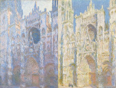
Left:
Claude Monet
French, 1840–1926
Rouen Cathedral, West Façade, 1894
oil on canvas, 100.1 x 65.9 cm (39 3/8 x 25 15/16 in.)
National Gallery of Art, Chester Dale Collection
Right:
Claude Monet
French, 1840–1926
Rouen Cathedral, West Façade, Sunlight, 1894
oil on canvas, 100.1 x 65.8 cm (39 3/8 x 25 7/8 in.) National Gallery of Art, Chester Dale Collection
Curriculum Connections
Materials
Warm-up Questions
Are these paintings of the same building? How are they similar and different?
Background
Color is what we see because of reflected light. Light contains different wavelengths of energy that our eyes and brain "see" as different colors. When light hits an object, we see the colored light that reflects off the object.
Red, blue, and yellow are the primary colors. With paints of just these three colors, artists can mix them to create all the other colors. When artists mix pigments of the primary colors, they make secondary colors.
Red + Blue = Purple
Red + Yellow = Orange
Blue + Yellow = Green
Did you know that your computer screen also works by using three primary colors? But here, since the colors are light from the monitor and not paints, the three primaries are not the same. Instead, your computer screen mixes other colors from red, blue, and green.
One important thing painters know: using complementary colors—the ones across from each other on the color wheel (red-green, blue-orange, and yellow-purple)—make both colors seem brighter and more intense. They seem to vibrate and pop out at you, the viewer.
Warm colors—reds, yellows, oranges, and red-violets—are those of fire and the sun. They appear to project. Cool colors—blues, blue-greens, and blue-violets—are those of ice and the ocean. They appear to recede.
Guided Practice
To get students thinking about color and the moods or feelings that colors can convey, read a book that focuses on color, such as The Day the Crayons Quit by Drew Daywalt.
Then view the slideshow below to introduce students to three artists—Claude Monet, Henri Matisse, and Wassily Kandinsky—and the way they used color in their paintings.
Slideshow: Monet, Matisse, and Kandinsky on Color
French artist Claude Monet liked to paint the same subject over and over again, at different times of day and in different types of weather. He painted Rouen cathedral in France some thirty times, but what fascinated him most was not the building—it was, he said, the surrounding atmosphere. Rather than quick studies of changing light effects, these pictures, slowly reworked in the studio, are carefully considered explorations of color and mood:
Around 1905 several artists, including Matisse, exhibited pictures in which heightened color was used to express a strong emotional response to nature. The painters were called "fauves," or wild beasts. The freshness and strength of the tones in Open Window, Collioure are typical of the fauves; Matisse's contrasts are subtle, giving this work a sense of serenity and radiance. Show students this painting (second to last image in the slideshow) to answer the following questions:
Wassily Kandinsky, raised in Odessa, Russia, learned to play the cello and piano as a child. As an artist, he drew connections between art and music and believed that colors and shapes could affect our mood. Show students Improvisation 31 (Sea Battle) (last image in the slideshow) without revealing the name of the title:
Activity
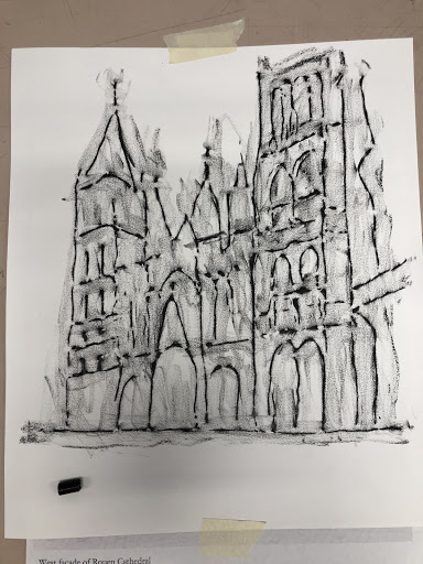
Download a faded version of the photograph of the west façade of Rouen Cathedral in Paris that Monet painted at all time of day and in all types of weather (the original photograph is the first image in the slideshow). Students will select a time of day and type of weather and then color over this faded image using appropriate hues in oil pastel (preferable to cover image, but crayons could also be used).
As an alternative that can accommodate students with visual impairments, print out a larger version of the images on 11 x 14 paper. Trace the lines of each image with hot glue to create a raised surface that students can feel. Then give students a plain piece of paper to lay over the image outlined in hot glue. Students can then create a texture rubbing with crayon over the paper. As a final step the students can paint over the crayon rubbing with watercolors.


On a printed version of the image, trace the lines with hot glue to create a raised surface that students can feel.
Extension
Now that students have investigated various uses of color in three artists’ works, they will fill out the “Colorful Language” worksheet to test their knowledge of color. Next, students will select one work of art from the slideshow as if it were a postcard of somewhere they visited. They will then write a short letter to a friend or family member describing what they saw, what time of day it was, and what the weather was like using the colors from the work of art as their guide.
The Elements of Art is supported by the Robert Lehman Foundation
VA:Cr2.1.1 Explore uses of materials and tools to create works of art or design.
VA:Cr2.2.1 Demonstrate safe and proper procedures for using materials, tools, and equipment while making art.
VA:Cr3.1.1 Use art vocabulary to describe choices while creating art.
VA:Re7.1.2 Perceive and describe aesthetic characteristics of one’s natural world and constructed environments.
VA:Re7.2.1 Compare images that represent the same subject.
VA:Re8.1.2 Interpret art by identifying the mood suggested by a work of art and describing relevant subject matter and characteristics of form.
VA:Re9.1.2 Use learned art vocabulary to express preferences about artwork.
Register for evening and weekend teacher professional development workshops and apply to participate in the summer teacher institute