Roy Lichtenstein’s 1961 painting
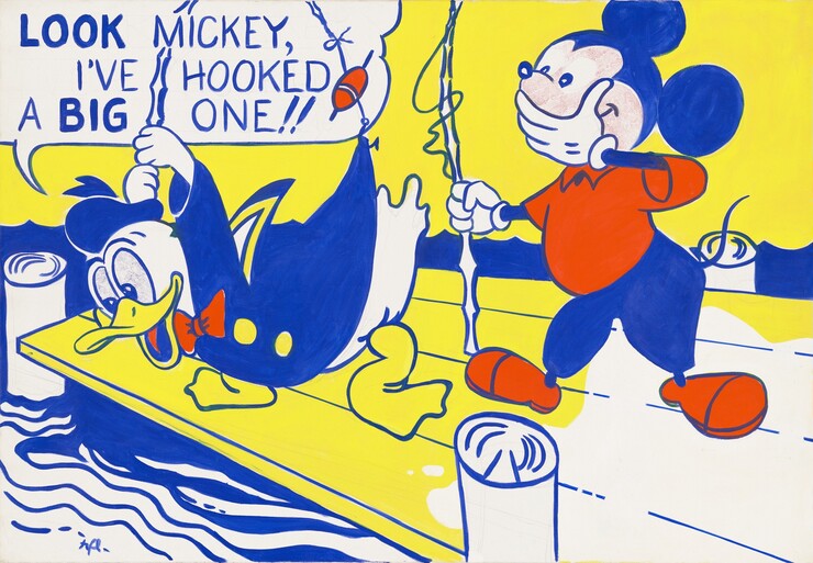
Roy Lichtenstein, Look Mickey, 1961, oil on canvas, Gift of Roy and Dorothy Lichtenstein in Honor of the 50th Anniversary of the National Gallery of Art, 1990.41.1
Look Mickey reveals much about Lichtenstein’s approach to painting his earliest canvases. The work incorporates a fully realized drawing under the painting, and we can see evidence of significant changes that the artist made as he developed the composition.

Illustration by Bob Grant and Bob Totten from Carl Buettner, Donald Duck: Lost and Found, 1960. © 1960 Disney
Lichtenstein began the process of transferring the illustration by drawing on his primed canvas with a pencil. Working on this scale—the painting is four feet tall—he was moving his full arm, not just the hand or wrist. Sweeping, gestural lines brought the rounded forms of the small cartoon into relationship with each other on the large canvas. While composing, he cropped and simplified the design, and many of the pencil lines remain visible around the edges of the painted forms. He compressed the color scheme to a few strong colors, and the abstracted patterns on the dock and in the water move the painting further away from the illustration.
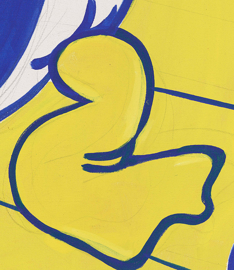
Detail of Donald’s foot
Here, the drawing is very loose and serves only to indicate the relative placement of the foot within the overall design. We see the pencil lines on the white priming as well as through the semitransparent yellow paint. As he applied the paint, he didn’t hesitate to make decisions based on earlier changes.
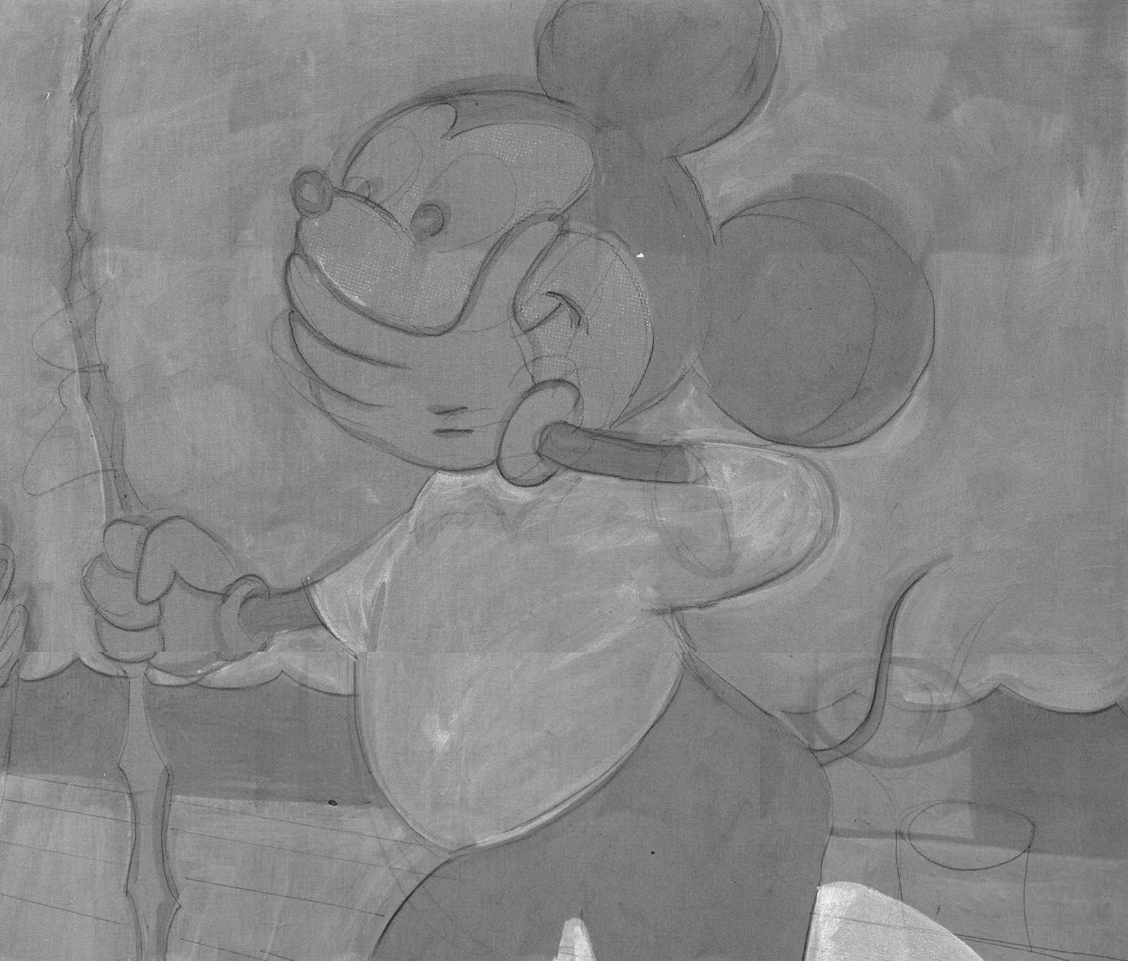
Detail of Mickey, infrared
While Lichtenstein clearly demonstrated sophistication and skill in his drawing, the paint covers much of this preliminary work. This infrared image of part of the painting allows us to see below the surface layers of paint, revealing the fluid and confident underdrawing.
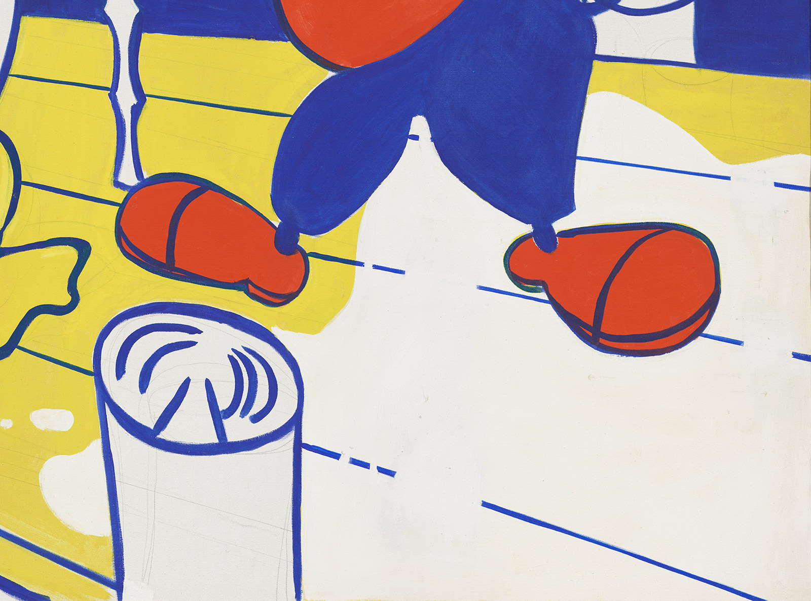
Detail of Mickey’s feet
Detail of Mickey’s feet, infrared
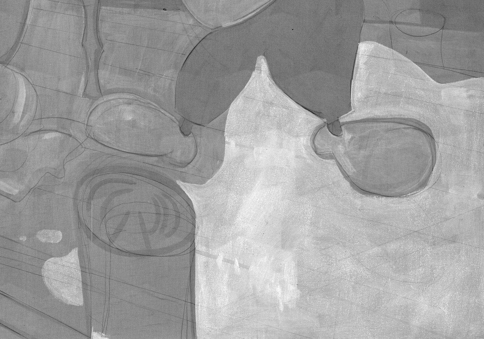
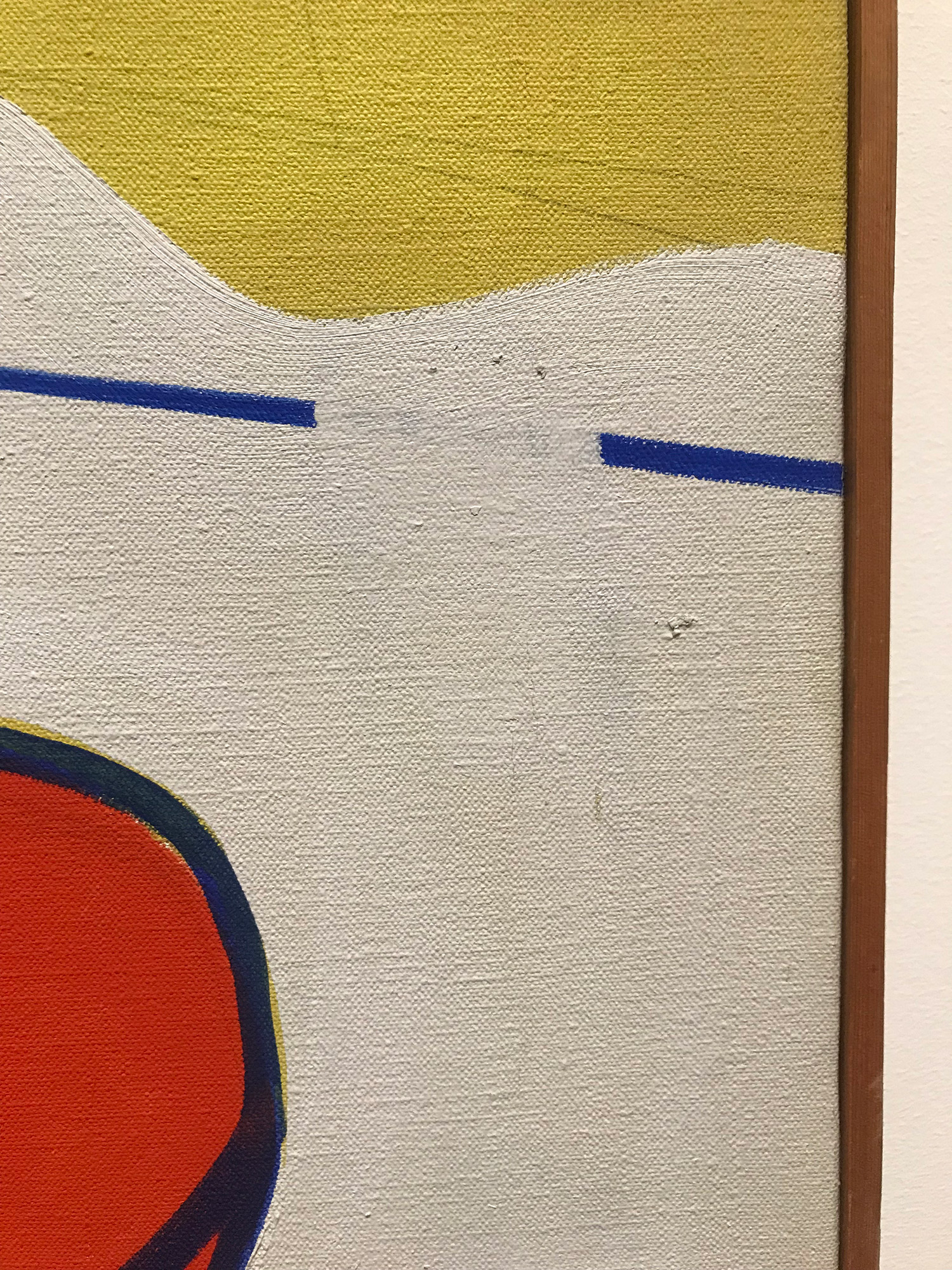
Infrared also allows us to see the artist changing his mind as the work progressed. Here we can see a large change in the color of the dock—what is now white was originally a continuous bright yellow in the initial stage of laying out the composition. He also applied more white paint to break the continuous blue lines between the boards of the dock. Looking closely around the edges of Mickey’s foot and the piling, we can follow these changes and see the white brushstrokes lapping over the yellow. (The piling does not appear white in the infrared because it was painted with a different pigment than was used for the white of the dock.)
Detail showing paint alterations
Several smaller “corrections” are also visible throughout the white background—for example, this change from a solid line to a dotted line above Mickey’s left shoe.
Detail of lettering
Detail of lettering, infrared
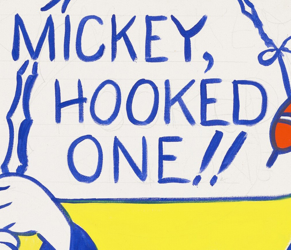
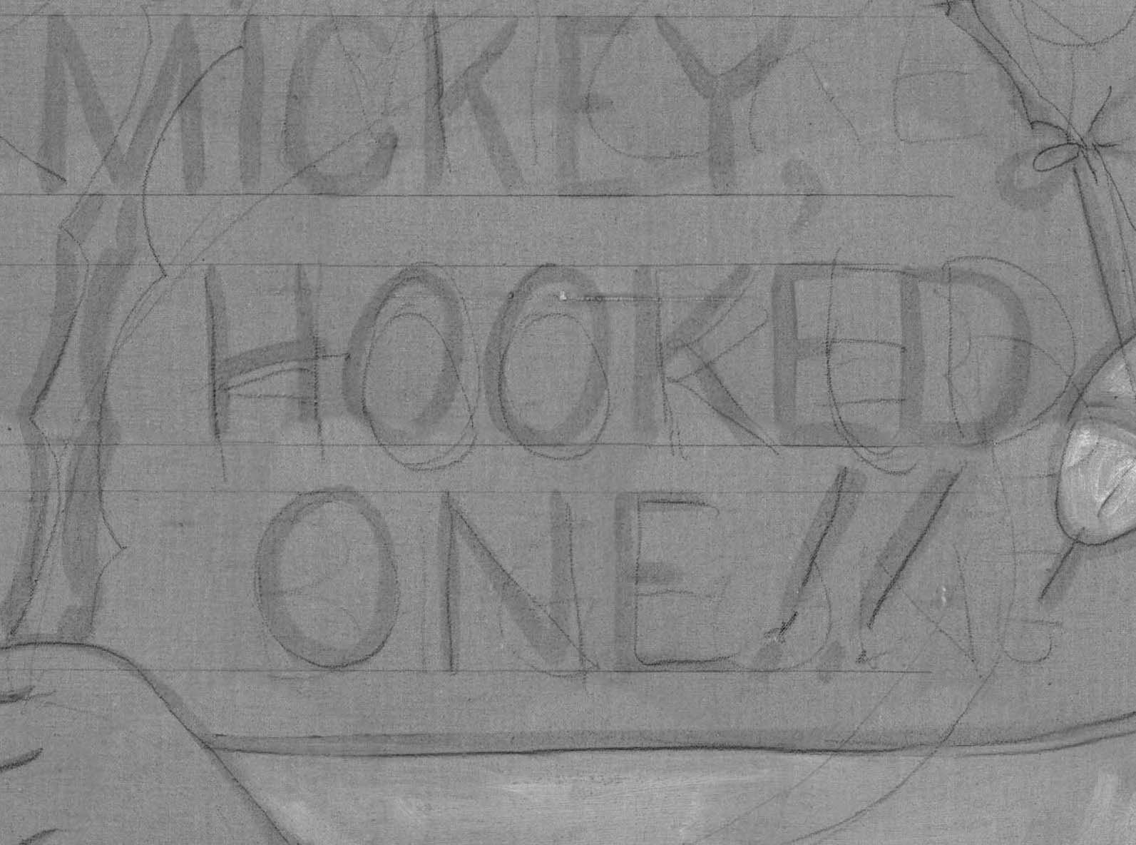
Here, we can see the placement of the letters on the white priming using a pencil, and the quick, gestural lines of blue paint that generally follow that initial suggestion.
The drawing is much more distinct when seen with infrared light.
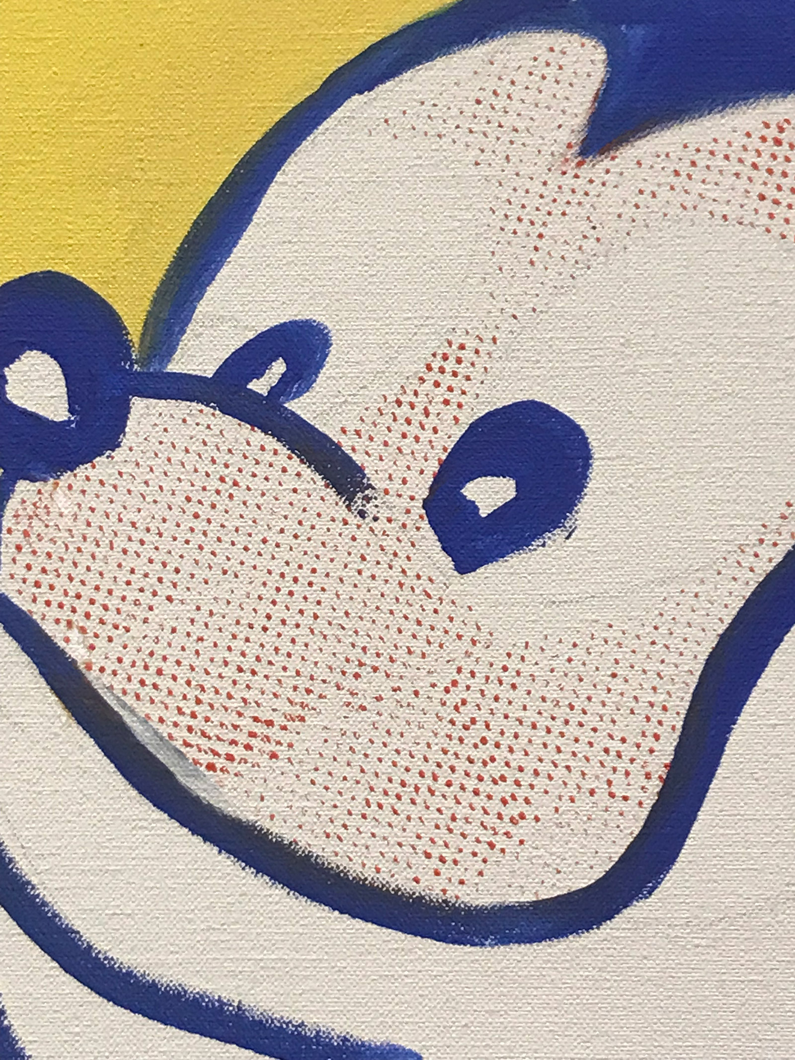
Detail of Mickey’s face
In Mickey’s face we can see the underlying pencil drawing, as well as Lichtenstein’s first attempt at reproducing the benday dots that are associated with commercial printing—in this case, by applying paint through a small perforated metal screen.
Look Mickey, with its clear traces of the artist’s developmental work, preserves a moment in which Lichtenstein hadn’t yet settled into a consistent process. It almost represents a first sketch of the idea of how one goes about enlarging cartoon imagery, which became a hallmark of his style, and it seems obvious that he was still figuring some things out about the method along the way. Within a year or two after completing this painting, Lichtenstein began to adjust and sharpen lines and the edges of forms in his works with increasing refinement, and he eliminated all visible evidence of an underlying sketch or drawing.
