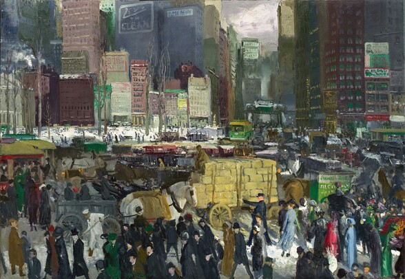
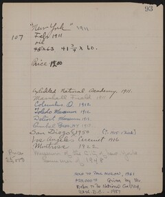
Bellows scholar Charles H. Morgan described this congested urban scene as “a remembered synthesis of a midsummer traffic jam, the Madison Square area packed with heavy delivery carts, patient Percherons, and crowds of pedestrians, the stolid buildings closing in on the sweltering scene.” The scene is actually set in the winter, and although it is based on a viewpoint looking uptown toward Madison Square from the intersection of Broadway and 23rd Street, Bellows did not intend it to represent a specific, identifiable place in the city. He instead drew on several such bustling commercial districts to create an imaginary composite, impossibly crowded image that would best convey a sense of the city’s frenetic pace of life. Completed in February 1911, New York is a remarkably ambitious painting in which visual details give way to the overwhelming movement and dizzying complexity of the modern metropolis as Bellows seeks to capture the dynamic, elusive essence of New York City [fig. 1] [fig. 1] Entry from artist’s Record Book about New York, The Ohio State University Libraries’ Rare Books and Manuscripts Library and the Columbus Museum of Art, Ohio.
The bird’s-eye view presents modern skyscrapers towering in the distance behind a row of 19th-century structures. Hoards of pedestrians stream across the foreground amid a profusion of horse-drawn carts and trolleys. They are caught in a variety of attitudes, some purposefully striding forward, others trying to cram themselves into a crowded trolley at the left, and yet others resigned to being stuck in an endless stream of traffic that seems to flow both to and from the congested avenue at the upper right. Although most of the faceless figures have lost their individuality in the crowd, some stand out by virtue of their gestures, such as the policeman directing traffic, the man shoveling snow, and the driver perched high on his cart. The compressed perspective contributes to the scene’s unrelenting claustrophobia. The only area of open space—as well as the sole manifestation of nature—is the small, snow-covered park in the middle ground that is punctuated by barren, leafless trees. Bellows has enlivened the gray wintery haze that pervades the scene with occasional bright patches of green, red, and yellow. Especially noteworthy in this respect are his depictions of advertising signs on the sides of buildings and vehicles, the majority of which are tantalizingly almost legible.
New York conveys a sense of the contemporary urban ambience of New York. In 1907 a writer for Harper’s Magazine described Madison Square as “an incessant progression: carriages and cabs, stages, drays, policemen on horseback, automobiles uncountable, ladies driving down to shops or on social errands in lower Fifth Avenue, all kinds of interesting people . . . a ceaseless and spirited panorama.” Some critics who saw New York at the National Academy of Design’s annual exhibition in 1911 found it harsh and confusing, yet discerned some redeeming characteristics. James Huneker of the New York Sun reflected this ambivalence:
The amazing transcription of New York life, an ugly, grimy, cross section thereof, by George Bellows . . . is crudely realistic, an almost impossible attempt by a painter with an eye that envisages a thousand details to make out of the jumble of oppositions a picture. But the synthetical grasp is lacking. There is too much portrayed, too much literalism, too little left to the imagination, too harsh an insistence upon the raw facts of a street scene. . . . We presume to call this ‘New York’ of his ‘amazing,’ we only wish it were composed of finer art. Naturally Mr. Bellows refuses to see his city through the rose colored glasses of Childe Hassam or Colin Campbell Cooper, or the matter-of-fact manner of robust Paul Cornoyer. We applaud his individual attitude. The thrice confused life of a local quarter is tempting to a realist’s brush, but to get it all into one picture and then compel it to come out at you across the frame is a well nigh impossible task. One applauds George Bellows and at the same time shudders at his truth-telling ugliness. If New York is really such a dirty, vile Gehenna as he pictures, then it is time the Fathers saw his pictorial arrangement and hastened to remedy so disgusting a state of affairs. Just how far truth should dominate a work of art we dare not say; even the doctors of aesthetics disagree on this point. . . . One thing is certain, if this canvas of Bellows is not very alluring it hums with life; not the overtones, but the noises and smells and disillusionizing sights.
A critic for the New York Times declared that New York was an example of Bellows “at his worst,” and opined that it “is very much the inchoate mass of unrelated types and objects that the poor old city is in reality when stripped of all her fascinating atmospheric disguises. It is a picture to move a beauty-loving observer to bleak despair, so devoid is it of the element of charm. Nor has it the austerity of pure truth.” Despite these strongly worded objections, the writer concluded that “it blusters around a turmoil of trucks, cars, vegetable carts, and pedestrians, and whatever aesthetic message it may have is indistinguishable in the hubbub, nevertheless there are both solidity and movement there, and there is freshness of color, and some day far in the future it will be pointed out, no doubt, as the best description of the casual New York scene left by the reporters of the present day.”
Other critics were more receptive. A writer for the Craftsman had trouble finding the correct distance from which to view the painting, but concluded:
If you are fortunate enough to strike just the middle distance when you first see it you are filled with amazement, so full is it of motion, of stirring existence. Trucks are darting through the crowd. Men and women are hurrying across the streets, trolleys are clanging their way in and out, a policeman is keeping people from being run over, you feel the rush, you hear the noise, and you wish you were safely home.
New York was greeted with enthusiasm when it was exhibited at the Marshall Field & Company department store in Chicago in October 1911. The perceptive H. Effa Webster of the Examiner described it as
crowded with giant architecture, crowds of people, lines of vehicles, all environing a street and surging over the highway; it’s the story of tumultuous life in a stupendously built city. This picture is not so attractive as some other examples, but it shows the wonderful truth of the artist in depiction, and he paints truth in all these sweeps and details. This picture rings with sincerity in a marvelous combination of big and little reflections that are actual, although clothed with subtle art.
Another Chicago critic observed that New York “rings with sincerity. . . . No wonder Bellows is tagged with the Gotham personality. . . . This artist’s work is worth going to see: it is a lesson in individuality in art.”
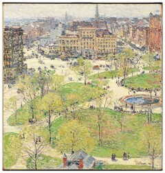
The scholarly literature has emphasized that New York is the preeminent painting that deals with the theme of modern urban life. Recently one art historian characterized it as “the painted apotheosis of the early 20th-century city,” a “picture of modernity in excess.” More accurately, it addresses New York City, specifically midtown Manhattan, as a city transitioning from 19th-century gentility to 20th-century hustle and bustle. Quiet, upper-class, residential neighborhoods like Madison Square and Union Square became commercial districts bordered by skyscrapers and teeming with activity. By embracing contemporary life and representing what is now an all too familiar sight in places like Times Square, Bellows revolutionized the New York urban landscape tradition. To use Samuel Isham’s phrase, conventional painters, and even the progressive realists among the Eight such as George Luks (American, 1866 - 1933), William Glackens (American, 1870 - 1938), and John Sloan (American, 1871 - 1951), often idealized their urban subjects to create “beauty removed from urban realities.” A perceptive critic like Huneker recognized that Bellows had rejected the standard formula used by American impressionist and tonalist artists for their numerous site-specific urban park scenes. Bellows’s novel interpretation of the modern urban environment, along with its implicit message of questioning the idea of progress, was a shock to conservative critics who were accustomed to idealized works such as Childe Hassam’s Union Square in Spring [fig. 2] [fig. 2] Childe Hassam, Union Square in Spring, 1896, oil on canvas, Smith College Museum of Art, Northampton, Massachusetts, purchased with the Winthrop Hillyer Fund, or any of a number of such scenes by Colin Campbell Cooper. The prediction that the New York Times critic had made in 1911 has come true, and Bellows’s New York can indeed be regarded as “the best description of the casual New York scene left by the reporters of the present day.” Vik Muniz’s New York City, after George Bellows (Pictures of Magazines 2) (2011) is one measure of its continuing currency.
Robert Torchia
September 29, 2016
