NARRATOR:
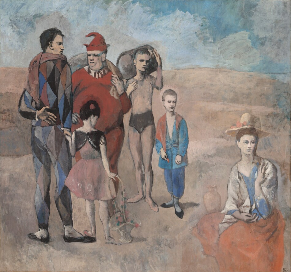
From late 1904 to early 1906, Pablo Picasso painted a recurring theme: the saltimbanque, an itinerant circus juggler or acrobat. Harry Cooper, curator and head of modern art, notes that Picasso identified so closely with the subject that he put himself in this picture.
HARRY COOPER:
That is a self-portrait on the left, the tall young man standing there. A lot of avant-garde artists identified with groups like this, who were marginal members of society, wandering on the outskirts, the hinterlands, of Paris that were being developed as Paris was expanding, so the landscape itself reflects their placelessness.
NARRATOR:
The title suggests the group of performers is a family. But they seem strikingly disconnected.
HARRY COOPER:
The eyes are heavily shadowed. They may be looking one way or another. Nobody is very expressive at all. But I think what carries the narrative is the gestures that are barely linkages of body to body. The hands and the feet are almost more important than traditional ways of telling a story.
NARRATOR:
Picasso reworked his canvas several times, adding figures and altering the composition. His painting style varies greatly throughout the picture.
HARRY COOPER:
The background, especially the sky, is the most expressive, most abstract part of the painting. It’s thinly painted, at least in the final layer. There are other passages where the paint is very thick, where it’s clearly been reworked. There’s no coherent, unified manner in the painting, which is one of the things that makes it so interesting and radical.


