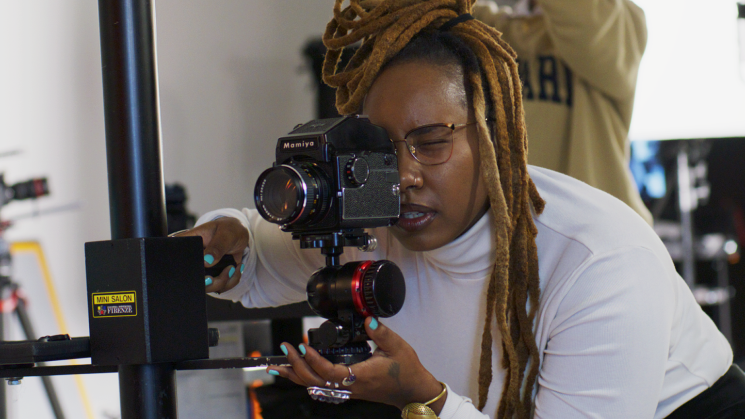
Stories
Read, watch, or listen to inspiring stories about art and creativity.
Jump to:
Editor’s picks

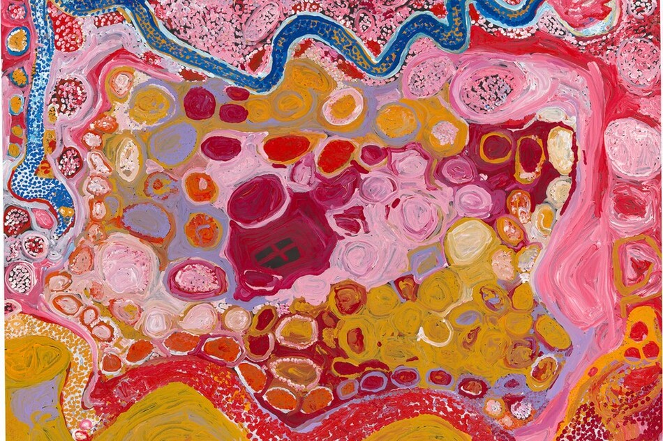
Article: Seven Things to Know About Australian Indigenous Art
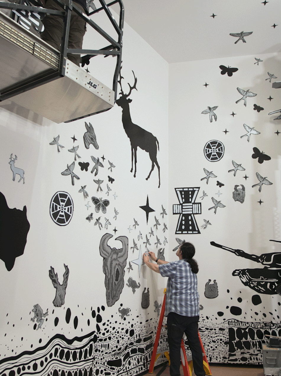
Explore the extraordinary breadth and beauty of the world’s oldest continuing culture, featured in our exhibition The Stars We Do Not See: Australian Indigenous Art.
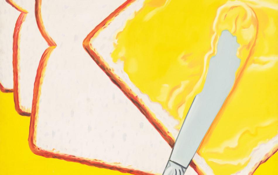
Article: Food Art Favorites to Feast Your Eyes On
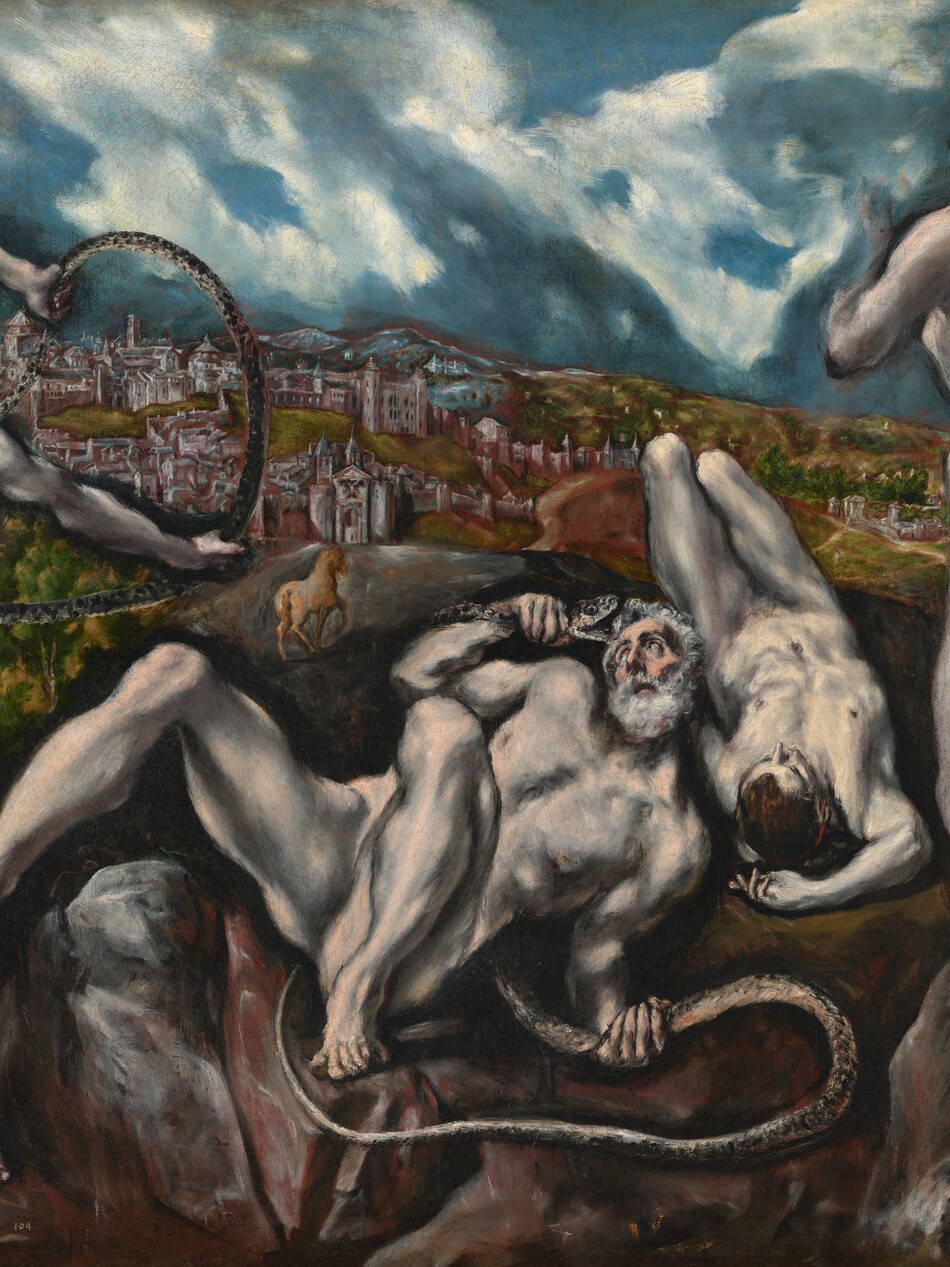
Feast your eyes on our top 10 favorite food paintings at the National Gallery and download your favorites for free. See still lifes and pop art by Paul Cézanne, James Rosenquist, Robert Seldon Duncanson, and more.

Video: Marie Watt Explores the Story of Turtle Island
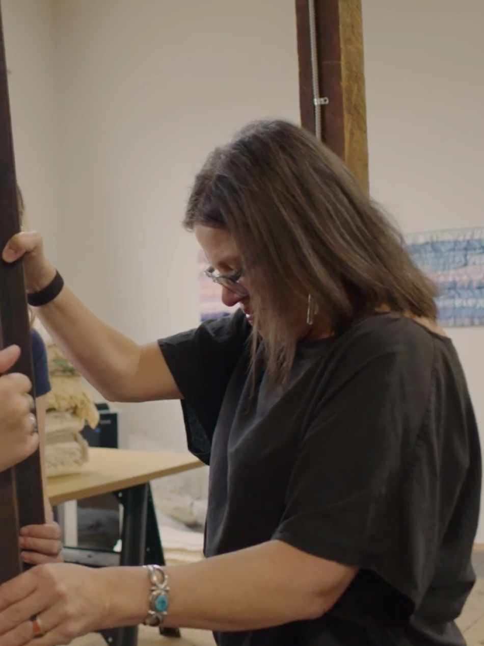
Marie Watt, an artist and member of the Seneca Nation, takes us into the story of Turtle Island and its connection to her work, family, and Native American history.
Articles
Look closer

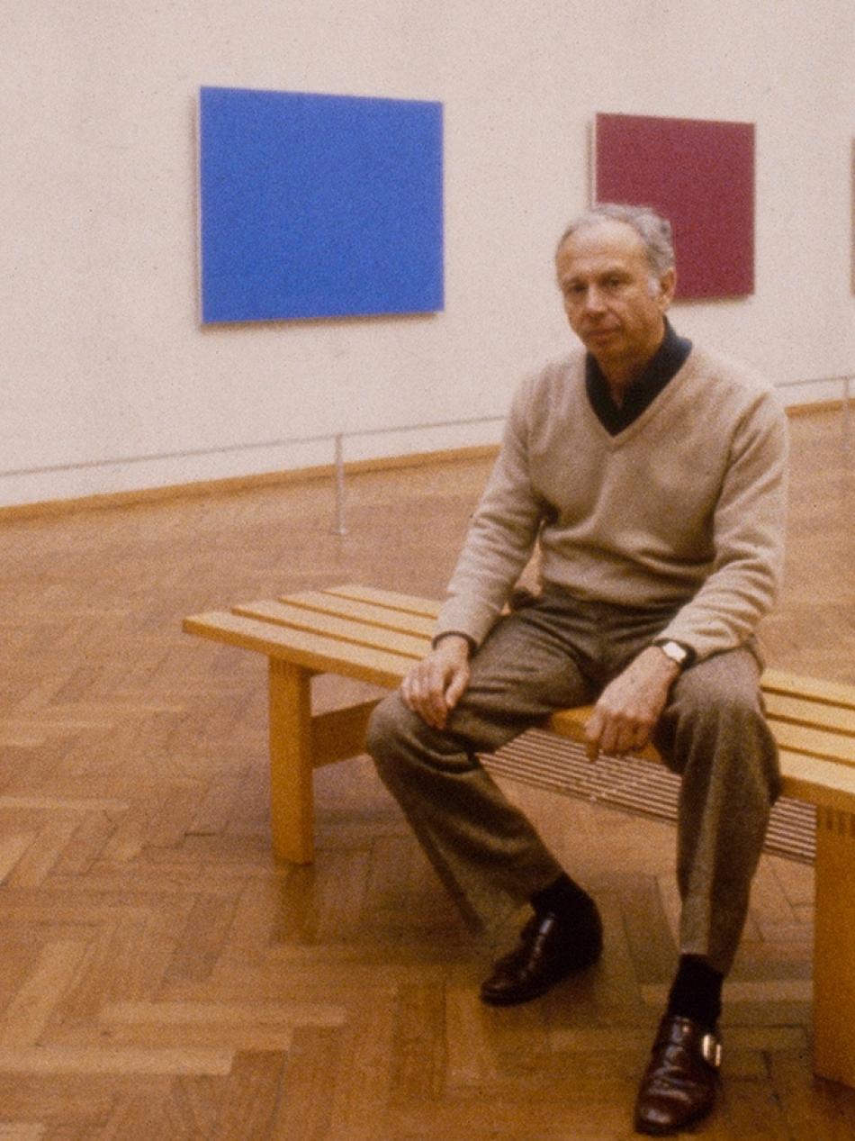
Article: How Herb and Dorothy Vogel Built One of the Greatest Modern Art Collections—and Then Gave It All Away
These unassuming art collectors fit more than 4,000 works in their tiny New York City apartment, all while working as a librarian and postal clerk.
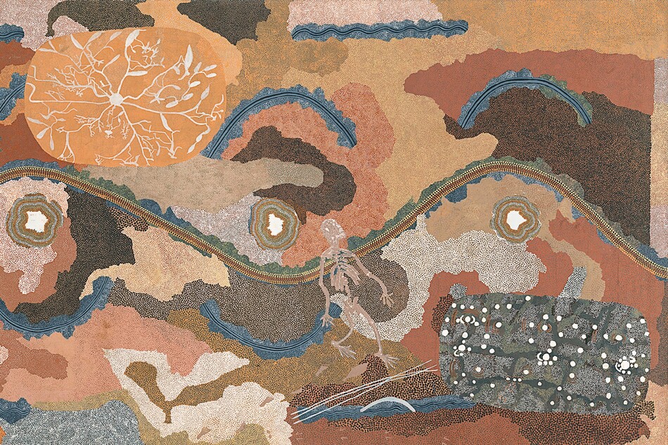
Article: Seven Things to Know About Australian Indigenous Art
Explore the extraordinary breadth and beauty of the world’s oldest continuing culture, featured in our exhibition The Stars We Do Not See: Australian Indigenous Art.
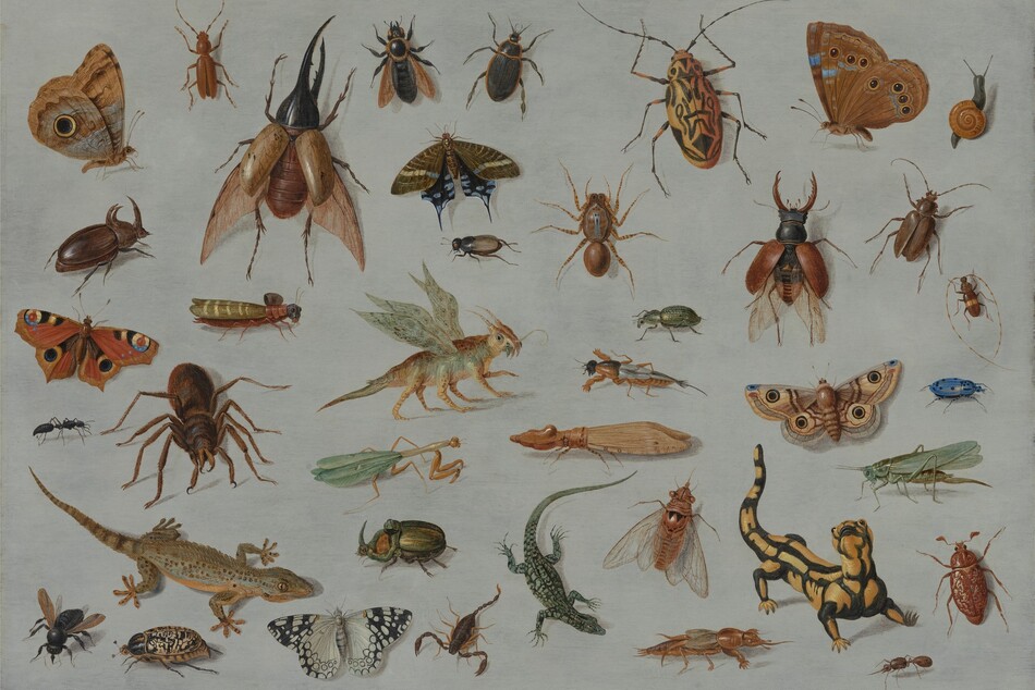
Article: Smithsonian Scientists on How Artists Depicted Five Curious Creatures
Staff at the National Museum of Natural History helped us identify the animals and insects in our collection.
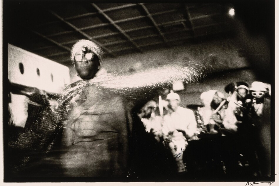
Article: What Is the Black Arts Movement? Seven Things to Know
Learn how the "cultural revolution in art and ideas" celebrated Black history, identity, and beauty.
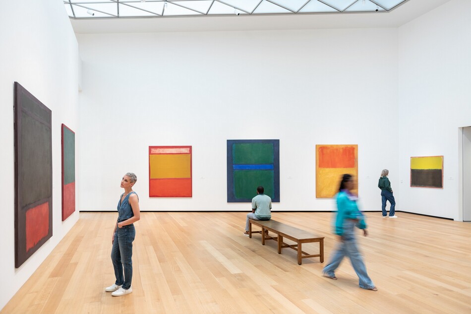
Article: In Plain Sight: What to Do When You Don’t “Get” Modern Art
Modern art can be intimidating. Here’s how to trust yourself and your own reaction to what you see.
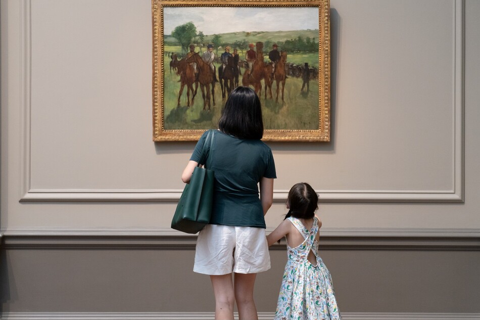
Article: In Plain Sight: Finding Your First (Art) Love
How can we learn to fall in love with a work of art? From curators who share the works that sparked their lifelong passion for art.
Videos
Catch up on our latest videos
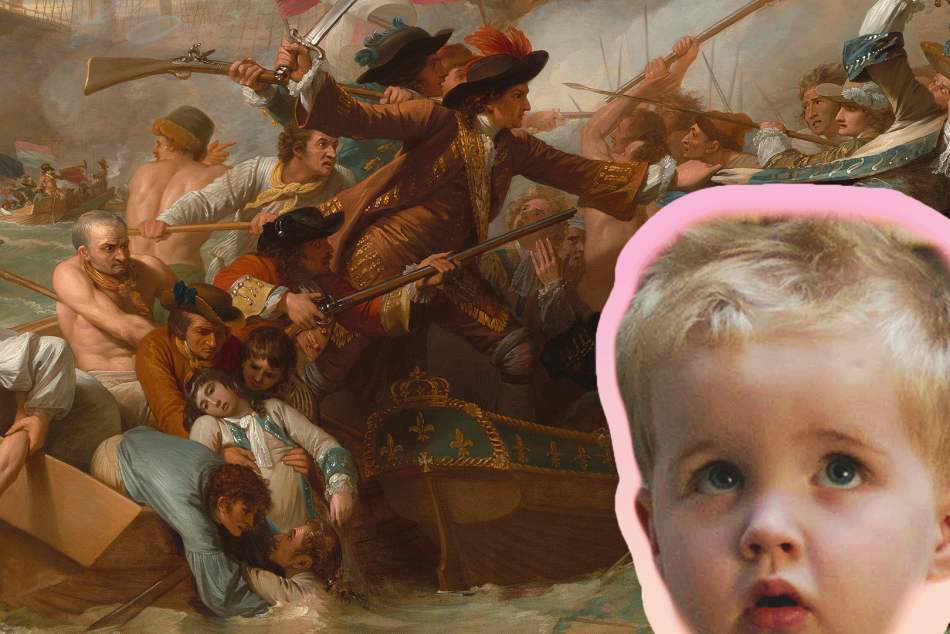
Video: What Do Kids REALLY Think About Art?
Sharp, hilarious, brutally honest kids react to some of our most iconic works.

Video: He Painted Bugs Like Jewels — And Changed Science
At a time when bugs were mostly feared or ignored, Joris Hoefnagel's exquisite insect drawings invited wonder—and helped change the course of scientific illustration.
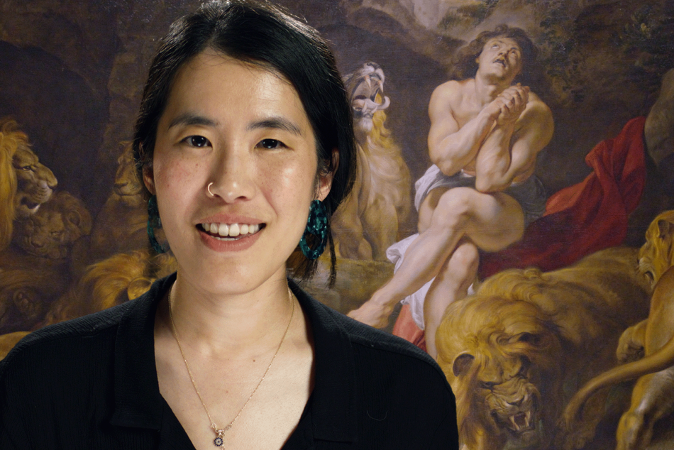
Video: Look Closer: The Art of Devotion
Explore powerful stories of devotion, love, and artistic passion through iconic works of art—from religious masterpieces to revolutionary portraits.
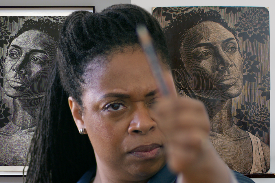
Video: Print Like a Great: Elizabeth Catlett
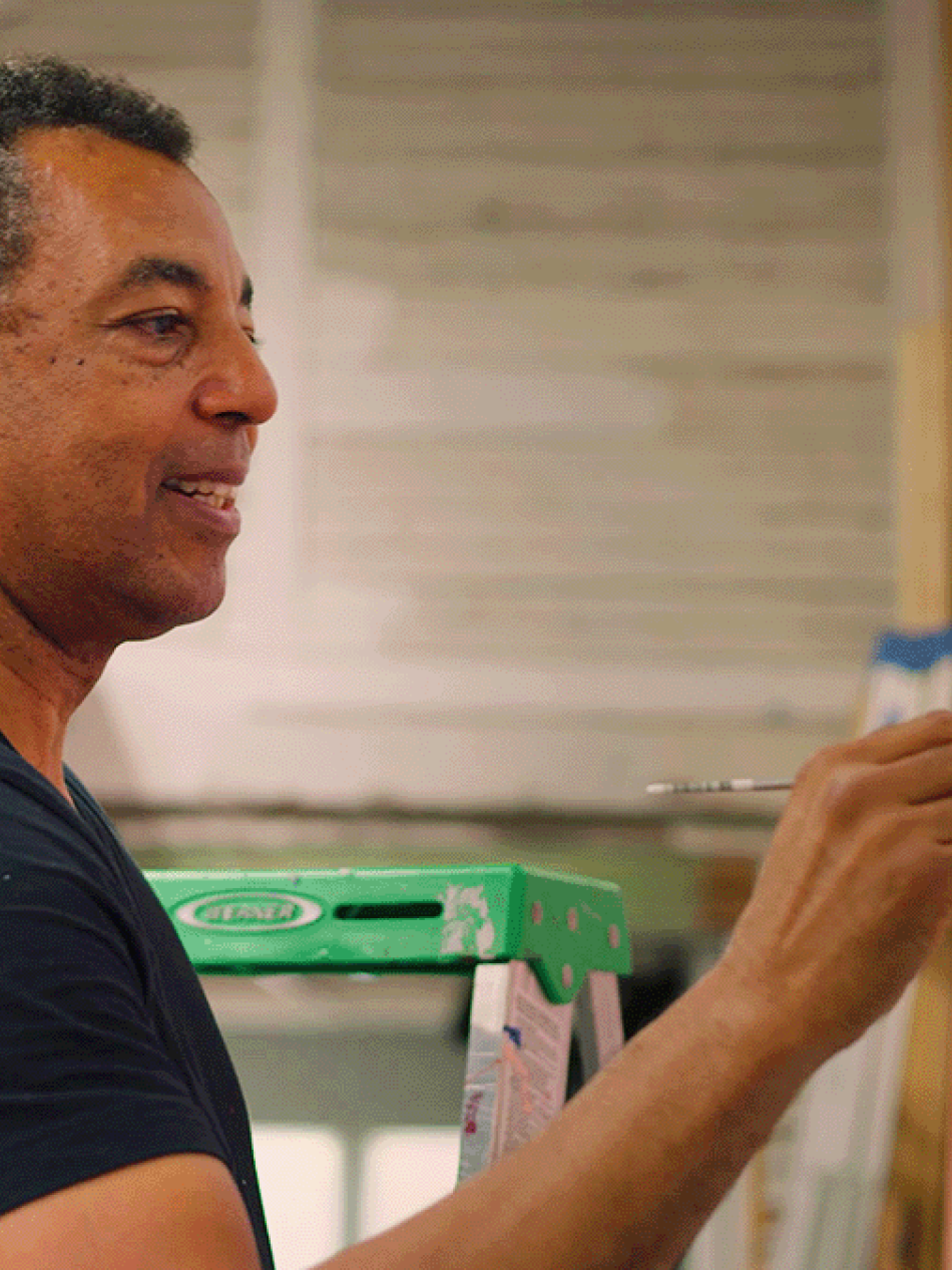
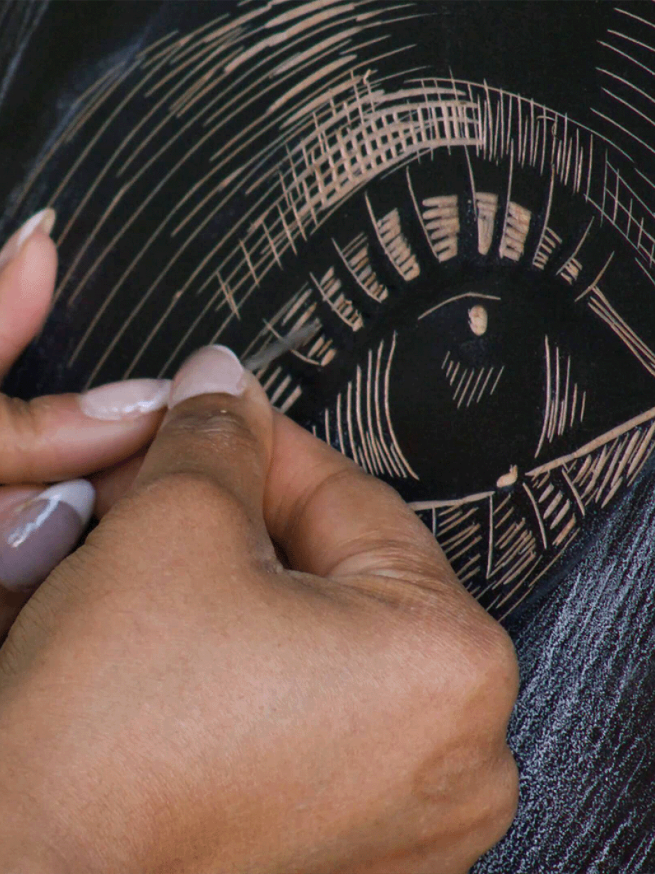
What happens when legacy, artistry, and womanhood collide? LaToya Hobbs creates a stunning woodcut portrait of Naima Mora, inspired by the life and work of legendary printmaker Elizabeth Catlett—Naima’s own grandmother.

Video: How This Photographer Used Selfies To Explore Layers Of Identity
Video essayist Nerdwriter helps us explore the extraordinary work of photographer Tseng Kwong Chi, whose iconic East Meets West series blends self-portraiture, performance, and satire.

Video: End as Beginning: Chinese Art and Dynastic Time
The A. W. Mellon Lectures in the Fine Arts presented by Wu Hung (2019)
Audio
Series
You may also like
Artworks
Explore our collection of nearly 160,000 works spanning the history of Western art.
Games and Interactives
Paint your own masterpiece, learn fun facts, or take an AI-powered journey through the collection.

